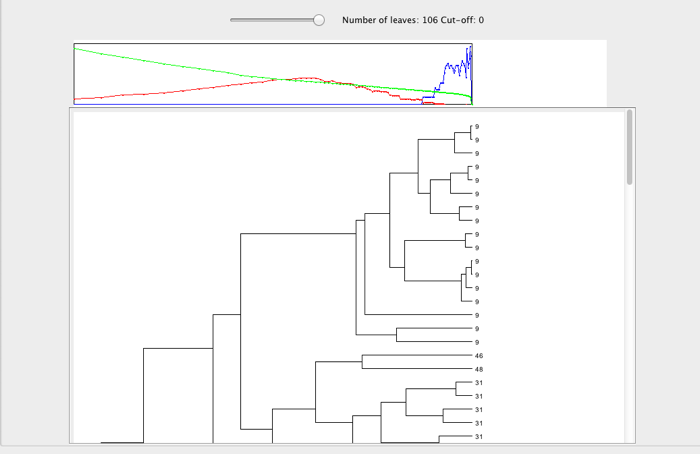
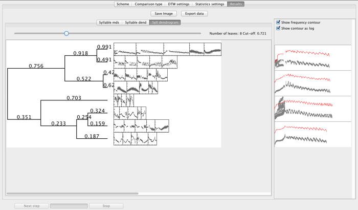
The dendrogram view in Luscinia provides two views of dendrograms. The first is more interactive, while the second is more suitable for producing figures for presentation.
Version 1:

Version 2:

Dendrograms are made using one of threes different algorithms: UPGMA, Ward’s Method, and Flexible Beta (Beta=-0.25). These three options provide three subtly different ways to decide how to hierarchically construct dendrograms. UPGMA tends to place outliers in their own branches, while Ward’s method will tend to form broad clusters. The choice of which to use can be made on the Analysis and Visualization window, under the drop down menu Dendrogram Method:
The first dendrogram display is clickable: If you click on a node within the dendrogram, a red dot will appear, and sketches of the spectrograms of all the leaves of that branch of the tree will appear on the right of the window.
Next to the leaves is the name of the signal unit. If you click on this text, it will launch a spectrogram of the sound that contains that unit. The names are only shown when the whole dendrogram is displayed. When that is the case, the dendrogram will quickly outgrow the space on the screen, and you will have to scroll to view it all. Alternatively, you can zoom in and out of the dendrogram using the slider at the top of the dendrogram.
Above the dendrogram is a graph panel that shows three measures of cluster validity - which allow you to decide where the dendrogram should be cut (i.e. how many clusters there are in the data). The green line (which descends from 1 to 0) is the proportion of total sum of squares variation between units that is left unexplained by the dendrogram at a given point. A dog leg in this measure indicates a good point to cut the tree. The red line shows the Global Silhouette Index - a measure of the relative similarity within clusters and separation between clusters - at each point in the tree. A peak in this measure indicates a good point to cut the tree. Finally, the blue lines shows the p-value associated with the Silhouette Index, estimated by simulation with random data. These indicate if there is more clustering at a certain point than would be expected in random data.
The dendrogram’s data can be exported to a spreadsheet by clicking on Export data. You will have the choice of exporting the validation statistics (as described above), or the raw dendrogram data. There is also an option to export Repertoire Sizes, which attempts to judge the repertoire size of different individuals in the dataset based on the peak in the silhouette index. This latter method is, as yet, unreliable.
The second dendrogram display is less interactive. You can zoom into and out of the dendrogram using the slider at the top of the panel, as before. Next to the dendrogram, Luscinia displays spectrogram sketches of (up to 5) examples from within that branch.
