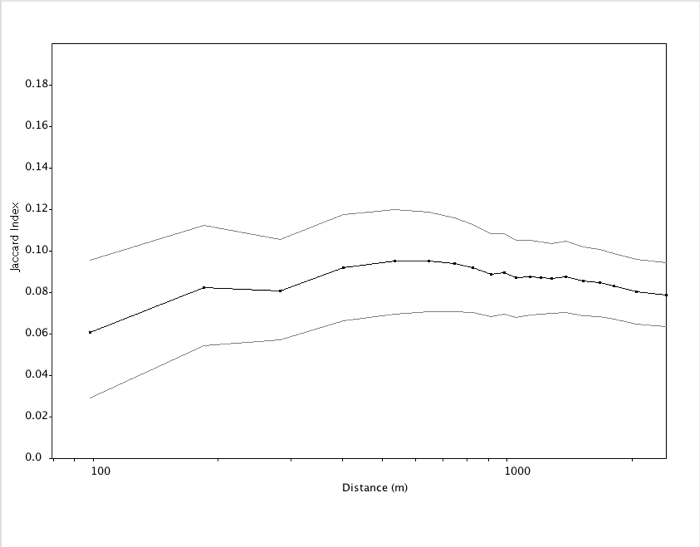
A major topic in research into animal signals is how they vary geographically. Luscinia eventually aims to have a broad range of analytical methods for investigating such topics. At present, one form of analysis is available. Luscinia calculates the Jaccard Index of repertoire similarity between individuals and plots them according to geographical distance, as shown in the example output above.
The Jaccard Index is a common measure of similarity between sample sets that varies from 0 (no overlap) to 1 (complete overlap in repertoire). Luscinia first calculates the Jaccard Index between each pair of individuals in the data-set. To do this, a threshold must be set by the user that determines whether two signals are the same or not. This is found on the Analysis and Visualization Window as Geog. Anal. threshold (%). The value entered here is weighted as the % of pairwise comparisons in the entire comparison set which are to be ranked as the same. For example, if the threshold is set to 1% for an analysis of song sharing, Luscinia will rank 1% of all the pairs of songs in the data set as the same. This parameter is rather arbitrary, considered in isolation, although it could be set with the reference to the clustering validity statistics provided with hierarchical clustering. It makes sense to carry out several analyses with different settings of this parameter to determine whether tightening or relaxing the similarity threshold influences results.
Next, the algorithm divides the individual-individual comparisons according to the distance between individuals, forming 20 equally-sized groups. Thus the first point on the graph above represents the 5% of comparisons between individuals that were closest to each other. It takes the average of Jaccard Indices within each of these groups, and of distances between individuals. The result is plotted as the black line in the output.
Finally, Luscinia carries out a delete-half jackknifing analysis of the data to estimate standard errors, which are also shown on the graph in grey
